
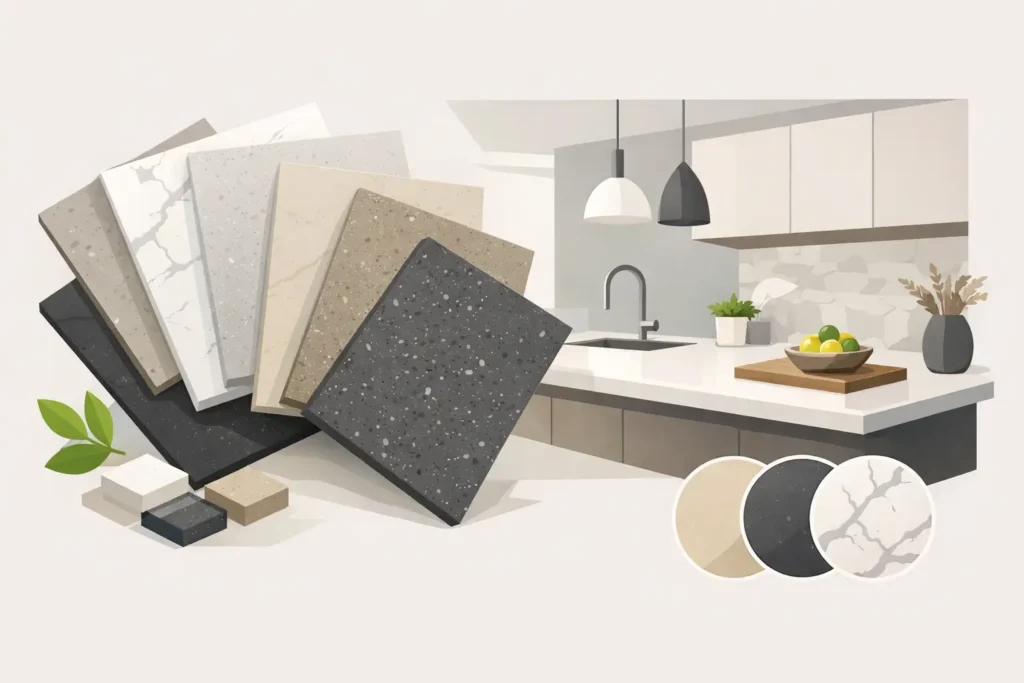
A countertop color can make a kitchen feel clean and open – or make new cabinets, flooring, and backsplash fight each other. That is why choosing the best quartz colors for kitchens should start with how you actually use the room, not just what looks good in a tiny sample. The right quartz gives your kitchen a finished look while holding up to busy mornings, dinner prep, kids, guests, and everything else life brings.
Quartz is a strong choice for Indianapolis-area homes because it is nonporous, low-maintenance, and available in a huge range of colors and patterns. Still, more choices can mean more second-guessing. Here are the colors that consistently work, what they pair with, and where homeowners can run into trouble.
The Best Quartz Colors for Kitchens Right Now
The most popular quartz colors are not always the loudest. The colors that age well tend to work with the fixed parts of a kitchen: cabinet finish, flooring, wall paint, and natural light. You can update hardware and bar stools later. Replacing countertops is a bigger project, so it pays to choose with the whole room in mind.
1. Soft White Quartz
Soft white remains one of the safest and most versatile choices. It brightens kitchens with limited natural light, makes smaller rooms feel less closed in, and works with nearly every cabinet color. Think warm white, creamy white, or white with subtle gray movement rather than a harsh, paper-white surface.
White quartz looks especially good with navy, green, black, stained wood, and classic white cabinets. It also gives a clean backdrop for a tile backsplash if that is where you want more personality.
The trade-off is simple: a solid bright white surface can show dark crumbs, coffee grounds, and heavy streaks more quickly. It is easy to wipe clean, but homeowners who do not want to notice every little thing may prefer a softly veined or lightly speckled white.
2. White Quartz With Gray Veining
For homeowners who want the look of marble without the maintenance concerns of natural marble, white quartz with gray veining is a strong pick. It brings movement to a kitchen without making the room feel busy. This is one of the best options for a high-end remodel, a resale-focused update, or a kitchen that needs visual interest without a bold color commitment.
The key is scale. Fine, quiet veining usually feels timeless. Very dramatic veins can look great on a large island but may overwhelm a small galley kitchen or compete with a patterned backsplash. Ask to look at the full slab, not only a hand sample. A sample may show one small vein while the actual slab has much more movement.
3. Warm White and Cream Quartz
Cool grays had a long run, but many homeowners are now bringing warmth back into the kitchen. Warm white quartz, ivory quartz, and soft cream options work well with oak, maple, walnut, beige tile, brass hardware, and warmer paint colors.
This is a practical choice in homes where the floors or cabinets already have warm undertones. A cool, blue-gray countertop against honey oak cabinets can make both materials look off. Warm quartz helps the kitchen feel intentional instead of pieced together.
Do not assume cream means yellow. Good warm quartz has a gentle softness that reads inviting, not dated. Bring cabinet doors, flooring samples, or clear photos to the stone selection appointment so you can compare undertones in person.
4. Light Gray Quartz
Light gray quartz is a dependable middle ground. It offers more contrast than white but keeps the room bright and easy to decorate. It is especially useful with white cabinets, where a light gray countertop creates definition without going too dark.
Gray also hides everyday dust and minor crumbs better than a pure white top. For flippers and rental-property owners, a soft gray quartz can be a sensible choice because it appeals to a broad range of buyers and tenants without feeling plain.
Watch the undertones here. Some grays lean blue, some lean green, and others have a warmer taupe cast. Under warehouse lighting, they can look similar. In your kitchen, alongside your cabinet color and lighting, the difference is obvious.
5. Greige and Taupe Quartz
Greige is the sweet spot between gray and beige, and it is one of the most useful colors for kitchens with warm flooring or mixed finishes. Taupe and greige quartz pair easily with white, cream, wood, black, and even muted green cabinetry.
These colors are also forgiving. They tend to disguise light dust, water spots, and the little marks that show up during a normal week. If your goal is a polished kitchen that does not require constant wiping to look presentable, this family is worth a serious look.
Greige is not the best fit for every room. In a kitchen with very cool gray cabinets, bright silver hardware, and blue-toned flooring, it may feel disconnected. The color needs to bridge the finishes in the space, not introduce another competing undertone.
6. Black or Charcoal Quartz
A dark countertop makes a statement. Black and charcoal quartz look sharp with light cabinets, natural wood, matte black hardware, and modern kitchens that need contrast. On a large island, a dark surface can become the feature that gives the whole room some weight.
Dark quartz has a reputation for being hard to maintain, but that depends on the finish and pattern. A flat, solid black polished top can reveal fingerprints, dust, and dried water marks. Charcoal with subtle movement, soft veining, or fine texture is often more forgiving.
Consider how much daylight your kitchen gets before choosing dark quartz everywhere. In a bright, open kitchen, it can look rich and dramatic. In a small kitchen with limited light, a black perimeter countertop may make the room feel tighter. One smart compromise is using dark quartz on the island and a lighter color around the perimeter.
7. Brown and Wood-Toned Quartz
Brown quartz is not the first color many people ask for, but it can be exactly right for a home with warm wood cabinets, brick accents, or traditional finishes. Chocolate, espresso, and softer brown quartz surfaces create depth and can hide everyday messes well.
This option works best when the overall palette has a clear direction. Pairing dark brown countertops with dark brown cabinets can make a kitchen feel heavy unless there is plenty of lighting and contrast from the backsplash and walls. With cream cabinets or light wood cabinetry, though, brown quartz can feel grounded and welcoming.
8. Soft Green, Blue, or Statement Quartz
For homeowners who do not want a kitchen that looks like everyone else’s, quartz now comes in muted greens, blue-grays, and more expressive patterns. These can look fantastic on an island, bar top, or small commercial service counter.
The practical rule is to use a statement color where it has room to be appreciated. A bold countertop plus busy cabinets, bold backsplash, and patterned flooring is usually too much. Let one element lead. If the countertop is the personality piece, keep the surrounding materials calmer.
How to Match Quartz to Your Cabinets
Cabinets usually make the decision easier. With white cabinets, almost any quartz color can work, but light gray, veined white, black, and greige are the most reliable. Wood cabinets often look better with warm whites, creams, taupes, and selections that have brown or gold undertones.
With black or deep blue cabinets, white quartz is a classic contrast that keeps the kitchen from feeling dark. Green cabinets can work beautifully with warm white, creamy quartz, or soft gray veining. If your cabinet color is bold, avoid choosing quartz from a tiny sample alone. The countertop covers a lot more square footage than most homeowners expect.
Do Not Forget Lighting and Finish
The same quartz can look different under warm recessed lights, cool LED bulbs, sunlight, and under-cabinet lighting. That is why we recommend viewing slabs in person and considering a sample in your own kitchen when possible. The goal is not to find a color that looks perfect in a warehouse. It is to find one that looks right in your home at 7 a.m., at noon, and during dinner.
Also think about sheen. Polished quartz gives a crisp, reflective look. Honed or matte finishes can feel softer and more contemporary, but they may show oils or marks differently. There is no wrong answer – just a finish that fits how you want the kitchen to look and how much day-to-day upkeep you want to notice.
A Better Way to Make the Final Choice
Start with two or three colors, not ten. Take photos of your cabinets, floor, backsplash, and wall color. Then look at full slabs with those finishes in mind. At Granite Networks Indy, we help customers narrow the field and select material at trusted local distribution centers, so you are not spending weekends bouncing between showrooms.
Price matters too. A color you love should still fit the project budget. Quartz pricing can vary based on the material line, thickness, edge detail, cutouts, and layout. Ask for clear square-foot pricing and make sure you understand what is included before you commit.
The best countertop color is the one that makes you happy every time you walk into the kitchen and still makes sense for your budget, lighting, and lifestyle. Pick the slab that works with your real home, not just the one that looked good in a staged photo.