
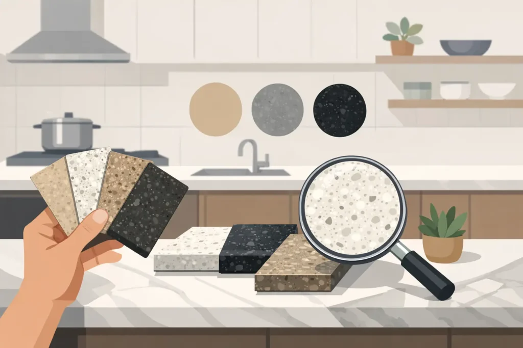
A granite sample that looks perfect under warehouse lighting can look completely different next to your cabinets at home. That is why knowing how to choose granite color is not about picking the prettiest stone from a rack. It is about choosing a surface that works with your room, your lighting, your budget, and the way you actually live in the kitchen.
Granite is natural stone, so every slab has its own movement, mineral flecks, veining, and color variation. That is a big part of what makes it beautiful. It also means the selection process deserves a little more thought than choosing a paint chip. The good news is you do not have to spend weeks running from showroom to showroom to get it right.
Start With What Is Staying in the Room
Before you look at granite, decide what other finishes are fixed. Cabinets, flooring, backsplash, wall paint, and appliances all affect which stone will make sense. If you are replacing everything, cabinets should generally come first. Granite has natural variation, while cabinet colors can be selected much more precisely around the stone you choose.
For a kitchen with white, cream, or light gray cabinets, you have the widest range of options. Soft white granite with gray movement creates a clean, updated look. Warm beige or gold-toned granite can make the room feel more traditional and inviting. A darker granite creates contrast and gives lighter cabinets more definition.
With medium or dark wood cabinets, the goal is usually separation. A dark brown granite on dark espresso cabinets can make a kitchen feel heavy unless there is a lot of natural light and plenty of lighter finishes elsewhere. A cream, white, or light taupe granite often brightens wood cabinetry without making the kitchen feel cold.
Gray cabinets are flexible, but pay attention to undertones. Some gray cabinets lean blue, some lean green, and some are actually warm greige. Bring a cabinet door or a good-sized sample with you when viewing slabs. A phone photo helps, but it is not enough for making a final decision.
How to Choose Granite Color Based on Lighting
Lighting changes everything. Indianapolis homes have plenty of kitchens with limited daylight, especially in older homes, townhomes, and layouts where the kitchen sits in the middle of the house. A granite that appears light in a bright distribution center may read much darker under a few recessed lights at home.
If your kitchen has limited natural light, lighter granite can help the room feel more open. White, cream, soft gray, and lighter tan stones reflect more light and are generally easier to pair with a wide range of finishes. That does not mean a dark countertop is off the table. It just means you should balance it with lighter cabinets, a light backsplash, or stronger task lighting.
In a bright kitchen with big windows, nearly any granite color can work. Dark granite can look rich and dramatic, while stones with stronger movement can become a focal point. Just remember that strong sunlight can highlight fingerprints, crumbs, and water spots on very dark polished surfaces.
The best move is to view a sample in your own kitchen at different times of day. Look at it in morning light, evening light, and with your overhead lighting on. Granite Networks Indy helps customers select stone at preferred local distribution centers, but we also encourage you to slow down long enough to see how your choices work together before fabrication begins.
Choose the Overall Look Before the Exact Slab
Most homeowners get better results when they first decide on the mood they want from the room. Do you want a bright, clean kitchen? A warm and traditional kitchen? A high-contrast modern look? A natural, earthy space with plenty of character?
Light granite is a safe choice for many homes because it keeps the room bright and tends to support resale appeal. White and cream stones with gray, taupe, or subtle black movement work well in kitchens throughout Carmel, Fishers, Westfield, and Indianapolis because they fit a wide range of cabinet and flooring styles.
Mid-tone granite, including taupe, beige, brown, and warm gray options, is practical for busy households. It generally hides everyday crumbs and minor water marks better than an all-white or nearly black surface. These colors can also be a smart fit for rental properties and flips where durability and broad appeal matter more than chasing a short-lived design trend.
Dark granite makes the strongest statement. Black, charcoal, deep brown, and blue-black stones can look incredible with white cabinets, stainless appliances, and a simple backsplash. The trade-off is maintenance visibility. Dark polished granite can show dust, streaks, and fingerprints more easily, particularly around the sink and cooktop.
Pay Attention to Pattern and Movement
Color is only half the decision. Granite pattern matters just as much.
Some slabs have a consistent, speckled appearance with small mineral variation across the surface. These tend to feel calmer and make it easier to coordinate a busier backsplash or patterned flooring. Other slabs have sweeping veins, large mineral clusters, or dramatic movement. Those slabs can be the centerpiece of the kitchen, but they need room to stand out.
If you want a bold, heavily veined granite, keep the backsplash simple. A basic subway tile, a solid-color tile, or even a painted wall may be enough. Pairing a dramatic slab with a busy backsplash, detailed floor tile, and patterned cabinet hardware can make the kitchen feel crowded fast.
Also ask to see the full slab, not just a small sample. A small piece may show one attractive vein or a single color, while the full slab reveals much more contrast. This is especially important for large islands, long runs of countertop, and waterfall edges. Natural stone is not supposed to look manufactured, and variation is normal. You simply want to know what you are getting before the cuts are planned.
Think About Your Backsplash at the Same Time
The countertop and backsplash need to cooperate. You do not necessarily have to choose the backsplash first, but you should have a direction.
If your granite has a lot of movement, pick up one quieter color from the stone for the backsplash. If your granite is more uniform, you have more freedom to add texture or a subtle pattern behind the range. White cabinets, a quiet granite, and a simple backsplash are popular for a reason: the combination stays flexible if you change paint, stools, or decor later.
Avoid trying to match every color in the granite exactly. Natural stone contains multiple minerals, and forcing a tile to match one small fleck often creates a result that feels accidental. Instead, coordinate with the stone’s main background color or dominant undertone.
Do Not Ignore Practical Use and Maintenance
Granite is durable, heat resistant, and a great choice for active kitchens, but different colors can make everyday use feel different. Light granite may show dark spills sooner. Black or very dark granite can show pale crumbs, dust, and water spots. A patterned mid-tone stone is often the most forgiving option for a family kitchen.
Finish matters too. Most granite countertops are polished, which gives the stone a glossy, classic appearance. Honed finishes have a softer, lower-sheen look but may show oils or fingerprints differently. Ask what finish is available for the slab you like instead of assuming every stone can be finished the same way.
Natural granite should also be sealed and resealed as needed. Sealing helps protect the surface from absorbing stains, but it does not make the countertop maintenance-free. Wipe spills promptly, use a stone-safe cleaner, and avoid treating the countertop like a cutting board. These simple habits keep the color looking right for years.
Match the Choice to Your Budget Without Settling Blindly
Price is not determined by color alone. Granite pricing can vary based on availability, slab size, thickness, pattern, origin, fabrication complexity, edge details, cutouts, and the amount of material required. A dramatic stone may be worth the upgrade for a smaller kitchen or a statement island, while a more readily available option may make more sense for a large rental or multi-unit project.
The important part is getting clear pricing based on the square footage you need. You should not feel pressured to buy more stone than your project requires just because a full slab is sitting in front of you. For homeowners and investors watching costs, that difference can matter.
When you compare options, compare the complete project, not just a tempting per-square-foot number. Measurements, sink cutouts, removal of old tops, installation, backsplash needs, and fabrication details all affect the final number. A straightforward quote keeps surprises from showing up after you have already fallen in love with a slab.
Use Samples, Then Trust the Full Slab
Take home samples when possible, but make the final call from the actual slab. Lay your cabinet, flooring, backsplash, and paint samples against it. Step back several feet. Look at the stone vertically and horizontally. Countertops sit flat, but viewing a slab upright can help you see the full movement before it is cut.
If there is a particular vein or area of movement you love, point it out before fabrication. Placement can matter on an island, around a sink, or at a peninsula. There are limits based on yield and layout, but a good fabrication plan starts with clear expectations.
Your granite color should make you want to walk into the kitchen, not make you second-guess every other finish in the room. Bring your samples, view the real slab, and choose the stone that works in your home under your lighting. A little guidance upfront saves a lot of frustration later, and leaves you with a countertop you will be happy to use every day.