
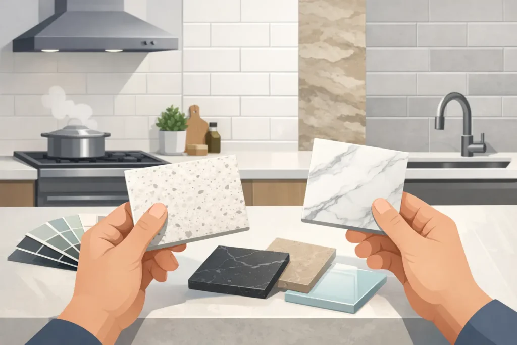
Picking stone is usually the fun part. The backsplash is where a lot of homeowners in Indy start second-guessing everything. If you’re wondering how to match countertop backsplash without making the kitchen feel too busy, too plain, or just off, the good news is this: you do not need to overcomplicate it. You need a few clear rules, a realistic look at your countertop pattern, and a plan that fits your budget and the way you actually use the space.
How to Match Countertop Backsplash Without Guessing
The first thing to know is that matching does not always mean identical. A countertop and backsplash should work together, not fight for attention. In some kitchens, the best look comes from a quiet backsplash that lets the stone lead. In others, especially when the countertop is simple, the backsplash can carry more of the style.
Most mistakes happen when both surfaces try to be the star. If you have a granite slab with a lot of movement, color variation, or bold veining, adding a loud backsplash on top of that usually makes the room feel crowded. If you have a cleaner quartz with light patterning, you have more freedom to bring in texture, shape, or contrast on the wall.
That is the real starting point. Before you shop tile, decide which surface gets the attention.
Start With the Countertop, Not the Tile Rack
Homeowners often do this backward. They find a backsplash tile they like, then try to force the countertop to fit. That can get expensive fast, especially if the stone you really need to make the tile work is outside your budget or harder to source.
The smarter move is to choose the countertop first. It usually covers more visual space, costs more, and has a bigger impact on resale. Once that decision is made, the backsplash becomes easier because you are matching to a fixed anchor.
If your countertop is granite, pay attention to the background color first, not every little fleck. If the slab reads warm overall, stay in warm backsplash tones. If it reads cool, keep the wall material cool too. You do not need to match every speck in the stone. You just need the undertones to make sense together.
With quartz, the process is often simpler. Many quartz colors are more controlled and consistent, so you can either blend the backsplash for a clean look or add a little contrast without things getting chaotic.
Read the stone from across the room
This is one of the easiest ways to avoid a mismatch. Stand back from the sample. What color do you notice first? Cream, white, gray, beige, black, gold? That dominant color should guide the backsplash more than the tiny details you only see up close.
A lot of people get tripped up by sample pieces under store lighting. What matters is how the countertop reads in the whole room.
Decide Whether You Want Contrast or Continuity
There are two good directions, and both can work.
Continuity means the backsplash sits close to the countertop in tone and overall feel. This creates a cleaner, calmer kitchen. It is a safe choice for open floor plans, smaller kitchens, and homes where you want broad appeal. White or cream subway tile with many granite and quartz options works for a reason. It is simple, flexible, and not likely to look dated next year.
Contrast means the backsplash is intentionally lighter, darker, smoother, rougher, or more patterned than the countertop. This can look great when done with restraint. The key phrase there is with restraint. If your countertop has heavy movement, use contrast through color value or finish, not through a busy pattern. If your countertop is plain, you can be a little bolder with tile shape or texture.
Neither approach is automatically better. It depends on the stone, the cabinet color, the lighting, and how much visual activity is already in the room.
How to Match Countertop Backsplash by Material Type
Different countertop materials call for different backsplash strategies.
Granite countertops
Granite usually has natural variation, so the backsplash often needs to calm things down. A simple ceramic or porcelain tile in a coordinating color is often the best move. If the granite has gold, brown, or cream tones, lean warm. If it has charcoal, white, or blue-gray notes, lean cool.
Avoid choosing a backsplash with multiple competing colors just because the granite has multiple colors. That sounds logical, but it usually creates clutter. Pull one main tone from the granite and build from there.
Quartz countertops
Quartz gives you more control because the pattern is typically more consistent. If you want a modern, clean kitchen, pair quartz with a straightforward backsplash that supports the look instead of distracting from it. If the quartz is plain white or light gray, you can bring in a handmade-look tile, stacked format, or subtle geometric shape without making the room feel overdone.
If the quartz has dramatic veining, treat it more like a statement granite. Let it lead.
Full-height stone backsplash
Sometimes the best backsplash is the same material as the countertop, carried up the wall. This works especially well with quartz and some granites when you want a higher-end, low-maintenance look. There is less grout to clean, and the whole kitchen feels more custom.
That said, it is not right for every budget or every style. In a kitchen with very active stone, full-height backsplash can be a lot. In a flip or rental project, simple tile may be the better value play.
Cabinet Color Changes the Answer
Countertop and backsplash do not live on their own. Cabinets change how both materials look.
White cabinets usually give you the most flexibility, but they also make undertone mistakes more obvious. A creamy backsplash next to a bright white quartz can look dingy. A cool gray tile next to warm granite can feel disconnected.
Wood cabinets add warmth and texture, so the backsplash often needs to be simpler. Dark cabinets can handle more contrast, but they also make a kitchen feel heavier if the countertop and backsplash are both dark. Light cabinets with busy granite often benefit from a quiet backsplash that keeps the room balanced.
If you’re changing countertops but keeping older cabinets, bring cabinet door samples or clear photos when choosing the backsplash. That one step saves people from a lot of expensive do-overs.
The Most Common Matching Mistakes
The biggest mistake is mixing warm and cool tones without meaning to. Beige granite with icy gray backsplash tile is a common one. Another is using a small busy mosaic with a heavily patterned countertop. Both surfaces end up competing, and neither looks better because of it.
A third mistake is choosing everything from tiny samples. A two-inch piece of quartz and a single tile do not tell the whole story. You need to see them together in larger pieces, under natural light if possible.
There is also the issue of trend chasing. Bold patterned backsplash tile can look great online, but if you are already investing in quality stone, you usually want the whole kitchen to hold up for years. Safe does not have to mean boring. It just means your materials still make sense after the latest social media trend fades.
A Simple Formula That Works in Most Kitchens
If you want the no-nonsense version, here it is. Busy countertop, simple backsplash. Simple countertop, more freedom with backsplash. Warm stone, warm tile. Cool stone, cool tile. And if you are stuck between two backsplash options, the quieter one is usually the better long-term choice.
That formula is not flashy, but it works in real homes. It works for family kitchens, remodels on a deadline, investment properties, and higher-end projects where you want the stone to do its job without visual clutter.
What Makes the Final Decision Easier
Put your actual materials together before you commit. Not close. Together. Countertop sample, backsplash sample, cabinet sample, flooring sample, paint sample. Look at them in morning light, evening light, and with the kitchen lights on.
This is where a lot of stress disappears. What felt hard in theory gets very clear when the materials are side by side. One option will usually look easy and natural. The other will look forced.
And if you are still unsure, go back to the function of the room. Most kitchens do better when at least one surface stays quiet. You want a kitchen that looks sharp on install day and still feels right after the appliances, dishes, and daily life move back in.
For homeowners around Indianapolis, that practical approach matters. You are not just buying a pretty sample. You are making a decision that affects resale, cleaning, project cost, and how happy you are every time you walk into the room. Granite Networks Indy helps people sort through these choices every day, and the pattern is always the same: the best kitchens are not the ones with the most going on. They are the ones where the materials make sense together.
If you’re choosing between a few countertop and backsplash combinations right now, trust your eye, keep the undertones consistent, and let one material lead. That is usually where the right answer shows up.